sprunki phase 180
Phase 180: The Forgotten Middle Child (But In A Good Way?)
Nobody talks about Phase 180. Seriously. It's always "Phase 300 this" or "Phase 56 that." Phase 180 is like that album between the band's breakout hit and their sellout masterpiece - overlooked but has its diehard fans.
I'm maybe one of them. Maybe.
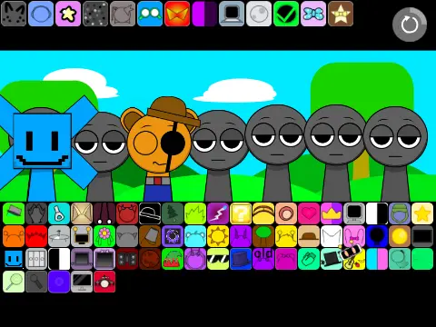
Let's get this out of the way first: it's big. Not Phase 300 big, but bigger than Phase 56. I'd guess... 50-70 icons? Maybe more? I stopped counting after the first three rows because honestly, who has that kind of attention span.
First Impressions (From Like 3 Months Ago When I First Tried It)
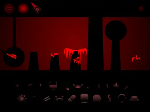
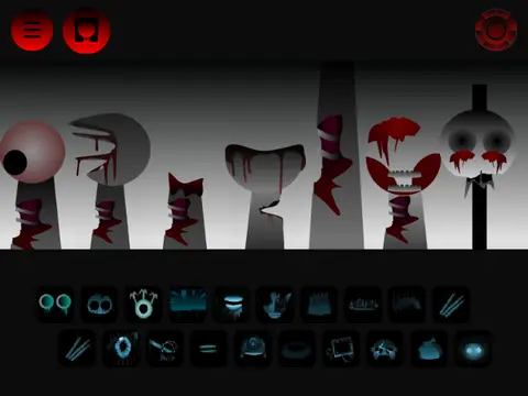
The colors are different. More... muted? Or maybe my screen brightness was low that day. There's a lot of blue-green-purple tones going on.
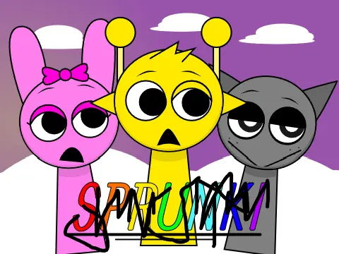
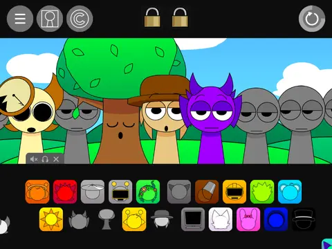
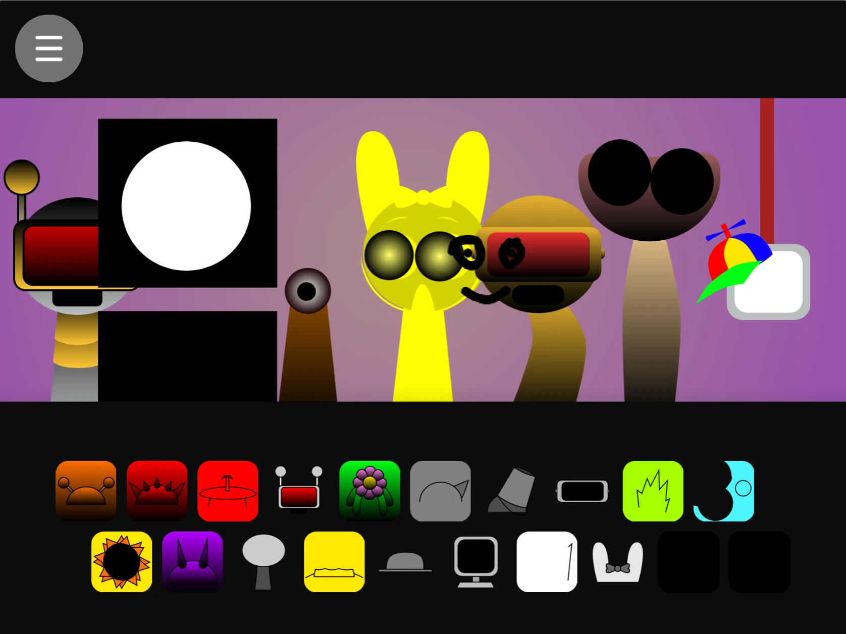
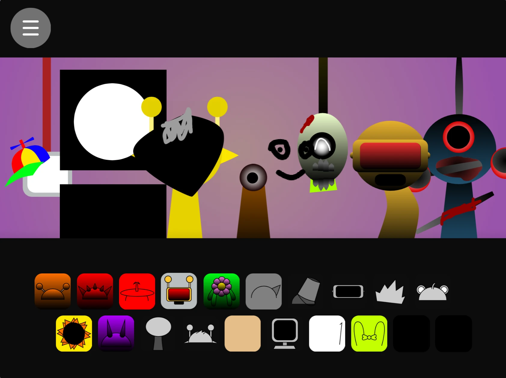
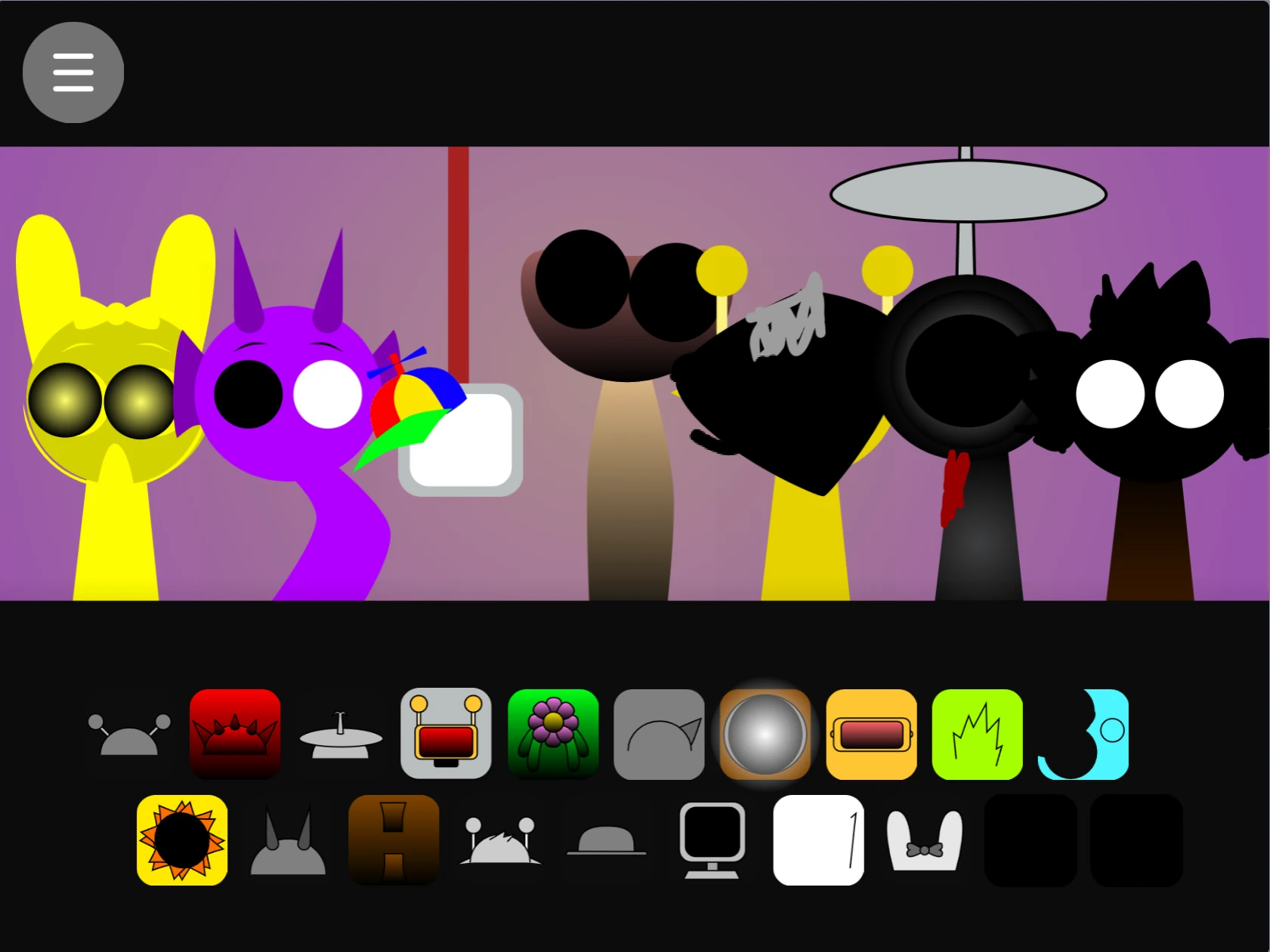
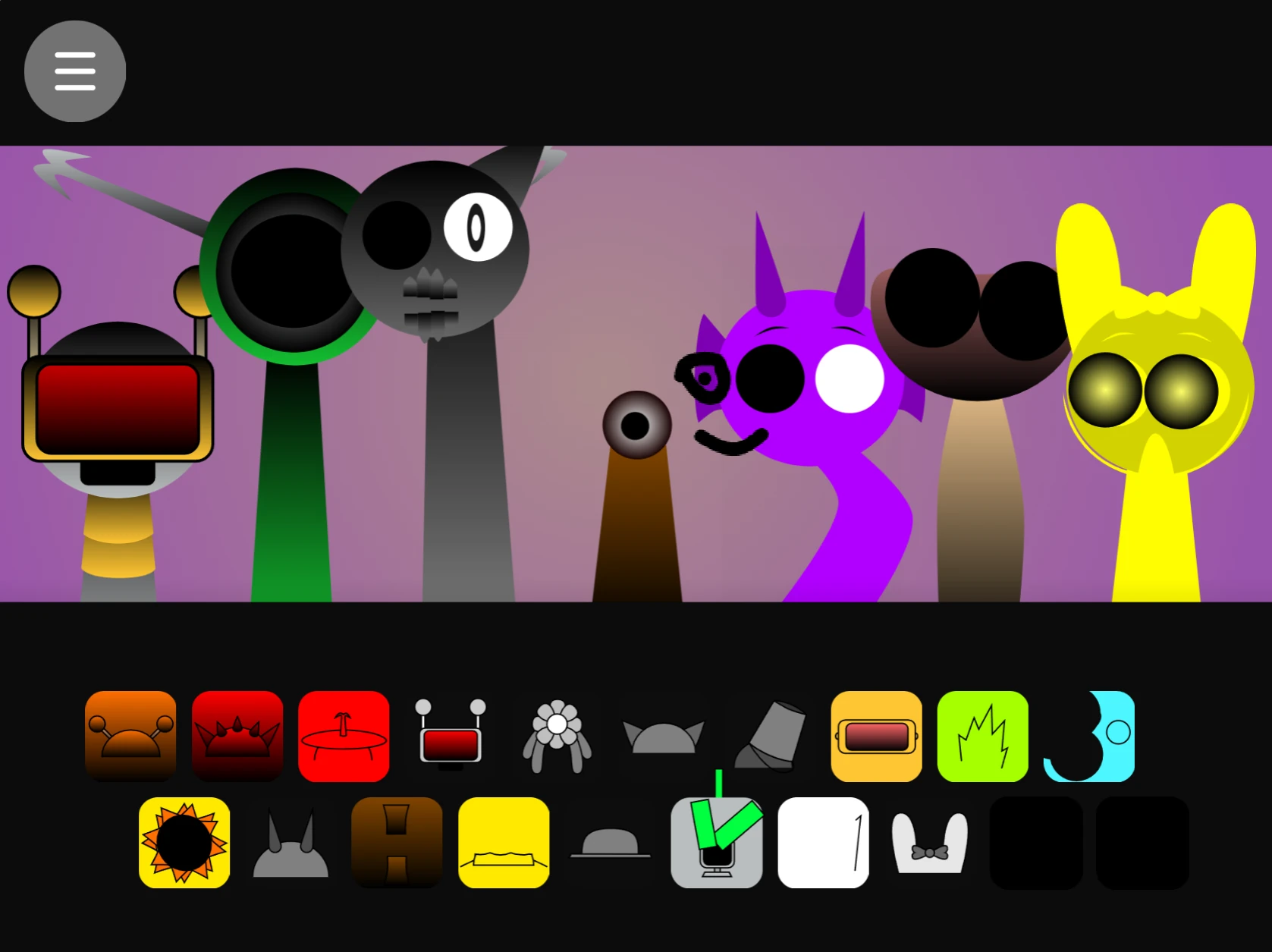
Characters look weirder too. Less cartoony, more... abstract? One looks like a melted clock (Dali would be proud). Another looks like a angry teapot. I don't know what the designer was on, but I want some.
The "Aha" Moment That Almost Happened
I spent like 20 minutes trying to recreate the sound of rain using only Phase 180. Results:
- Attempt 1: Sounded like popcorn popping
- Attempt 2: Sounded like static
- Attempt 3: Sounded like... actually not bad? Sort of rainy if you squint your ears?
The secret was using the droplet icon (obvious), but THEN dragging it SUPER slowly from the top to bottom of its slot. And adding that wavy line icon in the background. And muting everything else.

Would it fool anyone? No. Does it make my brain happy while I work? Yes.
Weird Technical Thing I Noticed
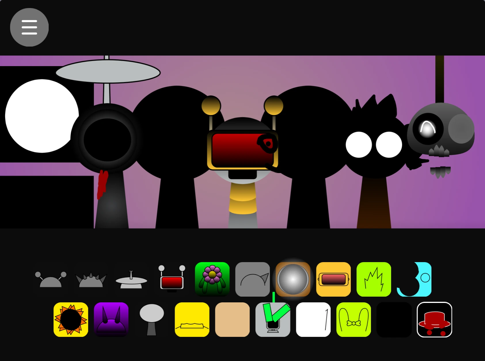
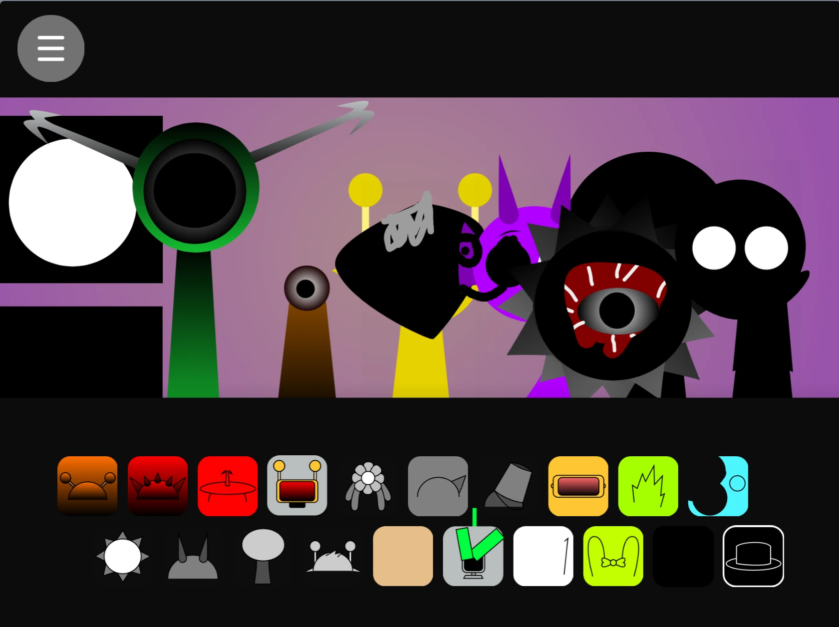
So the game screenshots - look at number 5. See how some icons have little glow effects? That's not just for show. If you click a glowing one and then another one quickly, sometimes they... sync up? Or create a rhythm? I can't explain it well, but it feels intentional.
Or maybe it's a bug. In Sprunki games, the line between "feature" and "bug" is very, very thin.
Comparison Time (Because Everyone Does This)
vs Phase 56: More complex, more experimental sounds, takes longer to "get"
vs Phase 300: Less overwhelming, more cohesive feel (maybe?)
vs Phase 4 (the classic): Absolutely nothing alike except the basic concept
Phase 180 feels like someone took the Sprunki formula and asked "what if we made it... artsy?"

My Favorite & Least Favorite Things
Love: The "ambient" category icons (look like clouds and waves). Consistent winners.
Hate: The metallic clang sounds. Every single one. Too harsh.
Meh: The vocal samples. Some people love them, I find them distracting.
Actual Useful Info (If You Can Call It That)
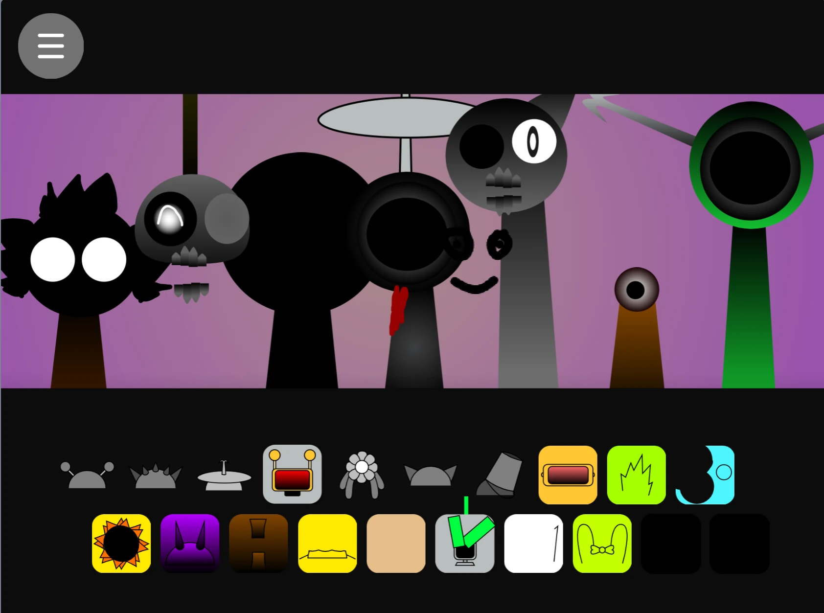
If you're new to Phase 180, don't try to use everything at once. Pick 3-4 icons max for your first few attempts. Seriously. The screenshot with all 7 tracks going? That's what happens after you've played for an hour and have lost all sense of what "good music" means.
Start with:
1. Any icon from the left column (the simpler looking ones)
2. Add something from the middle
3. Listen
4. Add ONE more if it needs it
5. Stop. You're done. Don't be greedy.
Random Thought I Had While Writing This
I wonder if the person who made Phase 180 is the same person who made Phase 56. The color palettes are similar but... off. Like they were working with different monitors or something. Or maybe I need to get my eyes checked.
Actually, you know what Phase 180 reminds me of? That indie game you find on itch.io that has like 50 downloads but is actually kind of genius in its own broken way.
Would I Recommend It?
To a complete Sprunki newbie? No, start with Phase 4.
To someone bored of the early phases? Yes, definitely.
To someone who wants "the best" Sprunki? Eh, that's subjective.
To someone with 15 minutes to kill and a curiosity about weird internet games? Absolutely.
Phase 180 isn't trying to be the biggest or most popular. It's just... there. Doing its own weird thing. And sometimes, that's enough.
PS: Try the combo: Clock + Wave + Star (the sparkly one). Sounds like a sci-fi movie about melancholy robots. Or maybe just my dishwasher. Either way.
